How the SBA digital service team rebuilt sba.gov

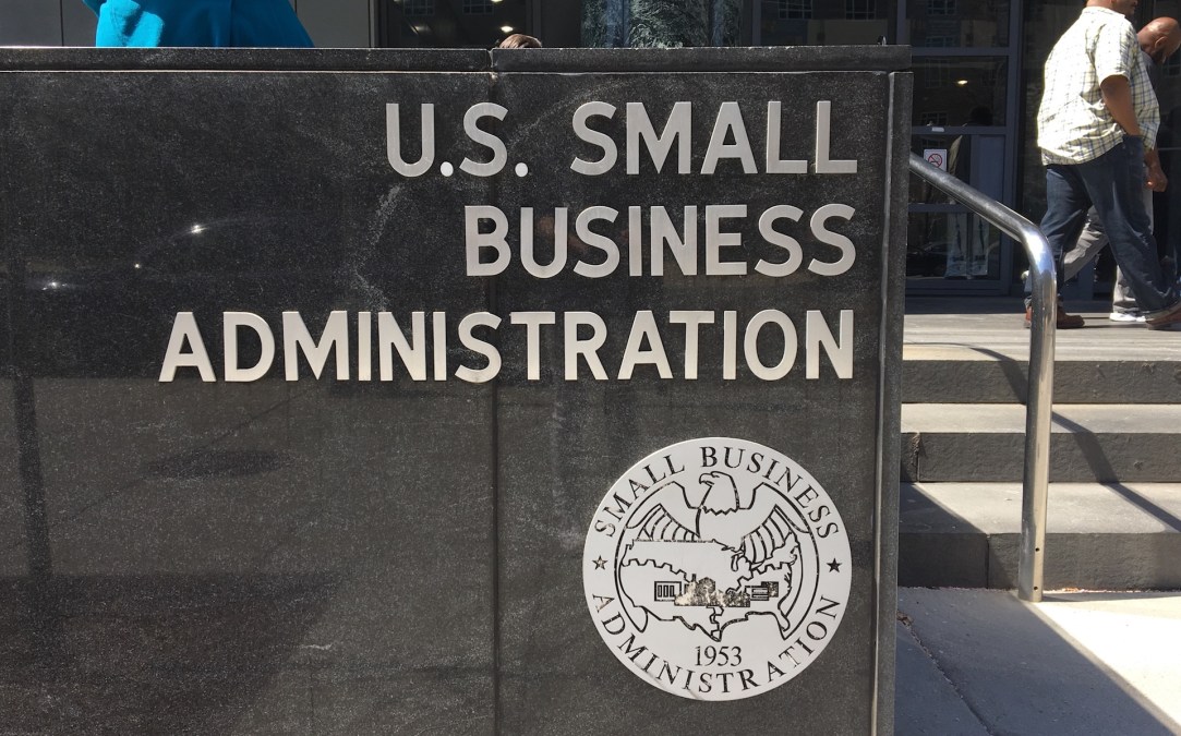
On the seventh floor of the U.S. Small Business Administration’s headquarters in southwest Washington, D.C., there’s an open-plan office filled with doodle-friendly whiteboards and a smattering of standing desks.
Welcome to the home of the SBA Digital Service, a team that’s revamping the way small business owners interact with the federal agency.
Not to be confused with the U.S. Digital Service, the SBA Digital Service team was created under previous administrator, Maria Contreras-Sweet. The team started off super small, but has grown to around eight individuals who work with a team of about 20 contractors. Around six USDSers also work in the office from time to time.
The team’s primary purpose, a job they first started in October 2017, is to overhaul sba.gov.
Emily Meeks, a specialist on the team, told FedScoop that the project has been all about transforming the site from a status she describes as “the Wild West” to a “working, modern website.” It hasn’t exactly been straight-forward.
Before the revamp, sba.gov’s backend was a Drupal 7 content management system built and controlled entirely by contractors out of the office. So when the digital service team took it over, they realized they didn’t really have the expertise necessary to work within the existing framework. And the previous contractors, understandably, weren’t particularly available. They had to start over.
The “full modernization” approach had its benefits, though. It gave the team a chance to use a new Drupal 8 CMS and a React front end. The site’s also cloud-hosted using Amazon Web Services.
Tech sorted, there remained the question of content. Meeks described the previous system as very decentralized — different pages would often advertise different or even conflicting information. Starting with the most popular sections of the website, Meeks and team set out to make the website usable for the average small business owner. They prioritized plain language and built new tools, like a Lender Match tool that allows small businesses to fill out a quick form and be connected with SBA-approved lenders.
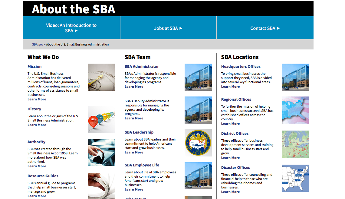
“We’re so close!” Meeks says, when asked about the stage of the revamp. Some pages, like the About Us section, haven’t made the transition yet. There, a visitor can see just how much the user experience has shifted — Meeks expects the team to finish this stage of the project by the conclusion of the fiscal year.

The old sba.gov. (Screenshot)
It won’t all end there, though. The digital service team, with the help of their contractors, will continue to “own” the site, taking feedback and exploring potential new tools. For example — can they find a way to expand Lender Match to rural areas? Or engineer a way for entrepreneurs to talk with the SBA’s district offices more readily?
“Websites are never really done,” Meeks said. “They’re living things.”


